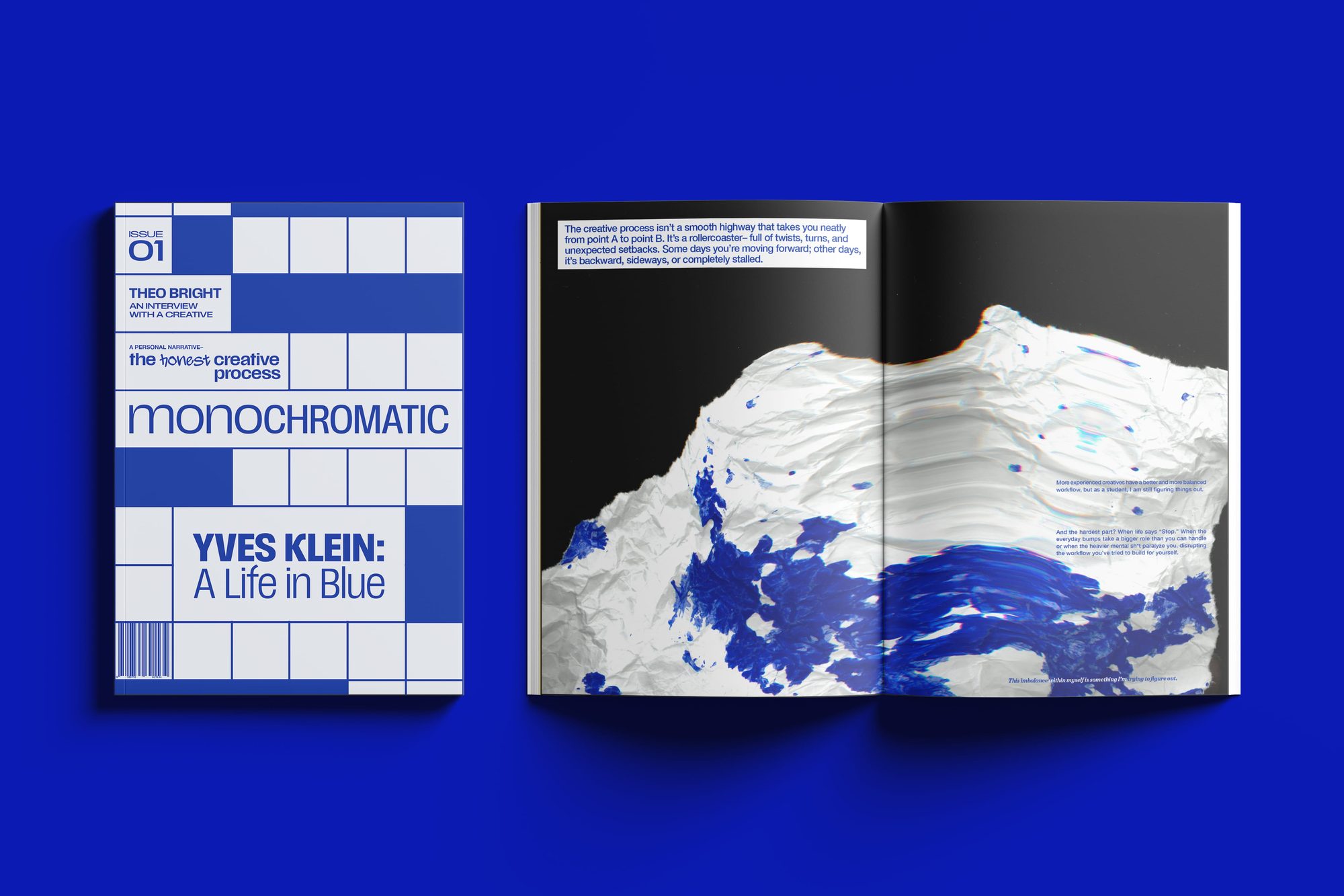
One color per issue, front to back.
Every creative I know looks for inspiration in the same place: a screen. I wanted to make something you hold.
The brief set what a magazine has to hold (a cover, an editorial, two articles, an interview, a colophon) but left the audience to me. I chose creatives, the people who love color and go looking for it. The honest problem underneath was my own: most of us pull everything from Pinterest and Instagram, and I wanted to build a reason to look up from the feed.
So every issue commits to a single color, and the whole magazine lives inside it.
The idea is to read that color from every side: where it comes from, how it makes us feel, how it behaves in design and out in the world. Then the next issue picks a new color and starts over. What I want is for you to finish one and get a little curious about the next.
Issue 01 is International Klein Blue.

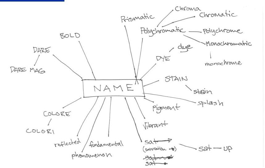
The name came out of a thesaurus. I wanted one the right people would read as theirs in a second.
I read the whole Merriam-Webster entry for color: chromatic, polychrome, prismatic, pigment. Monochromatic was the one that held the concept in a single word. One color, fully explored.
A typographic logo.
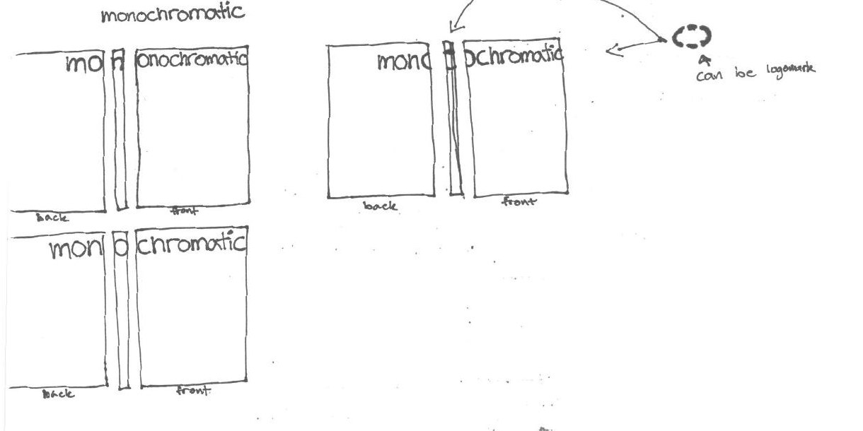
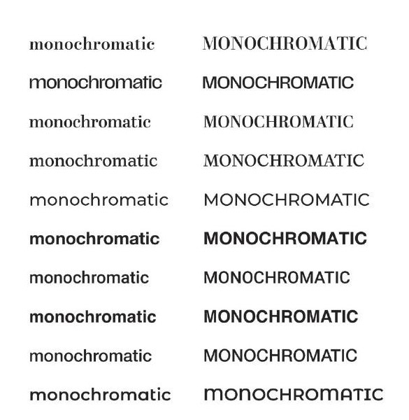
Getting there took a lot of rounds. It started on paper as a cover idea: mono on the back, chromatic on the front, with the split in the middle as a possible logomark. From there it went digital: testing typefaces, weighting the two halves, and finding where the word should break.
It landed on Scale VF, a variable font with a superfamily. The light lowercase against the condensed caps sets two weights of one family side by side, the same move the magazine makes with color: one hue and its tints.
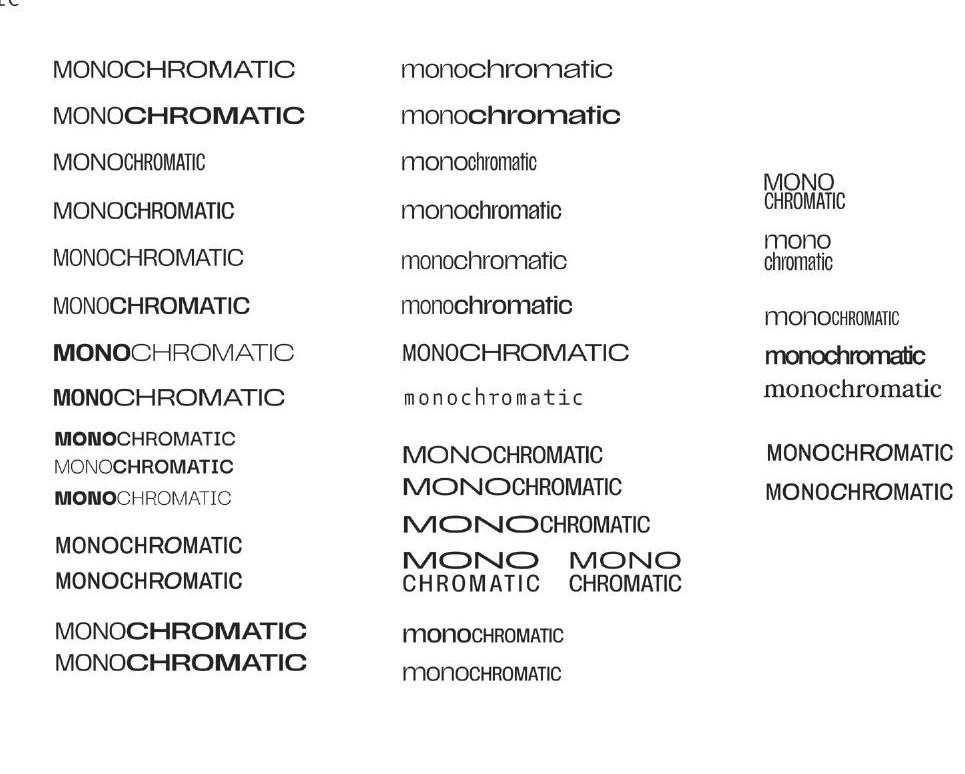

One blue with a scale that stretches.
International Klein Blue doesn't read as corporate the way many blues do, it feels timeless. Everything in the issue is drawn from that one blue and its monochromatic scale.
Scale carries the headlines and the body. Helvetica Neue does the quiet work underneath, and a graffiti face I drew myself on Procreate signs the personal pages.
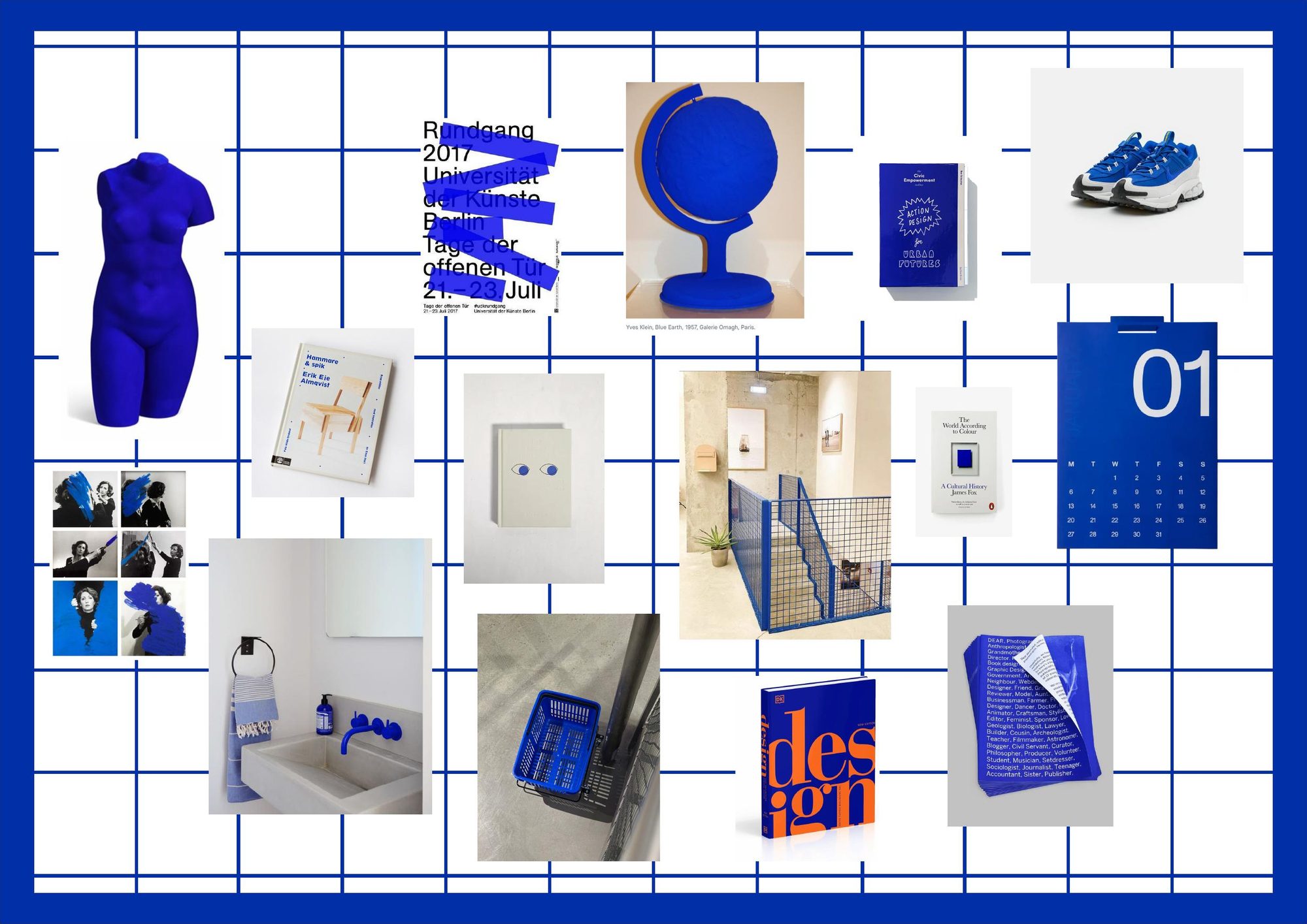
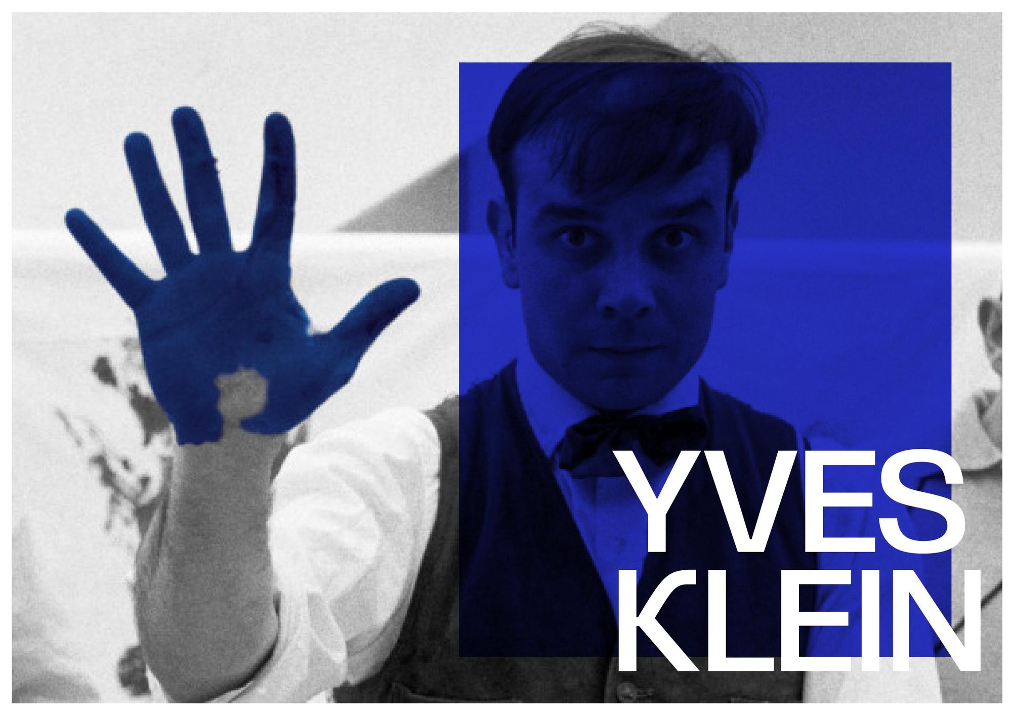
Blue, read through the artist who spent his life inside it.
The first issue reads International Klein Blue through Yves Klein: where the color came from, and what he was reaching for. Around that sit the pieces that make a magazine feel like one. A personal editorial, an interview, small facts, and quiet color spreads to breathe between them.
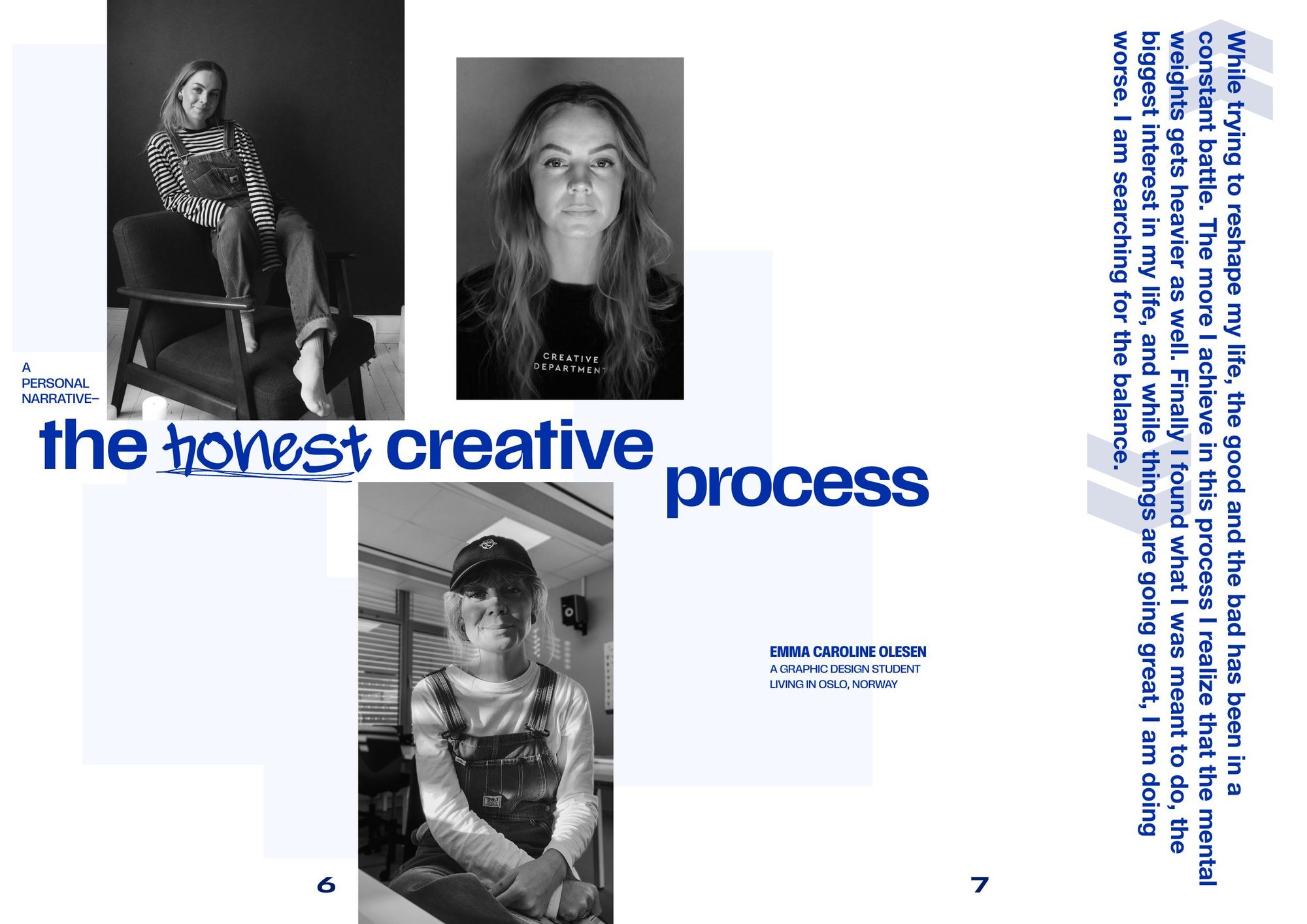
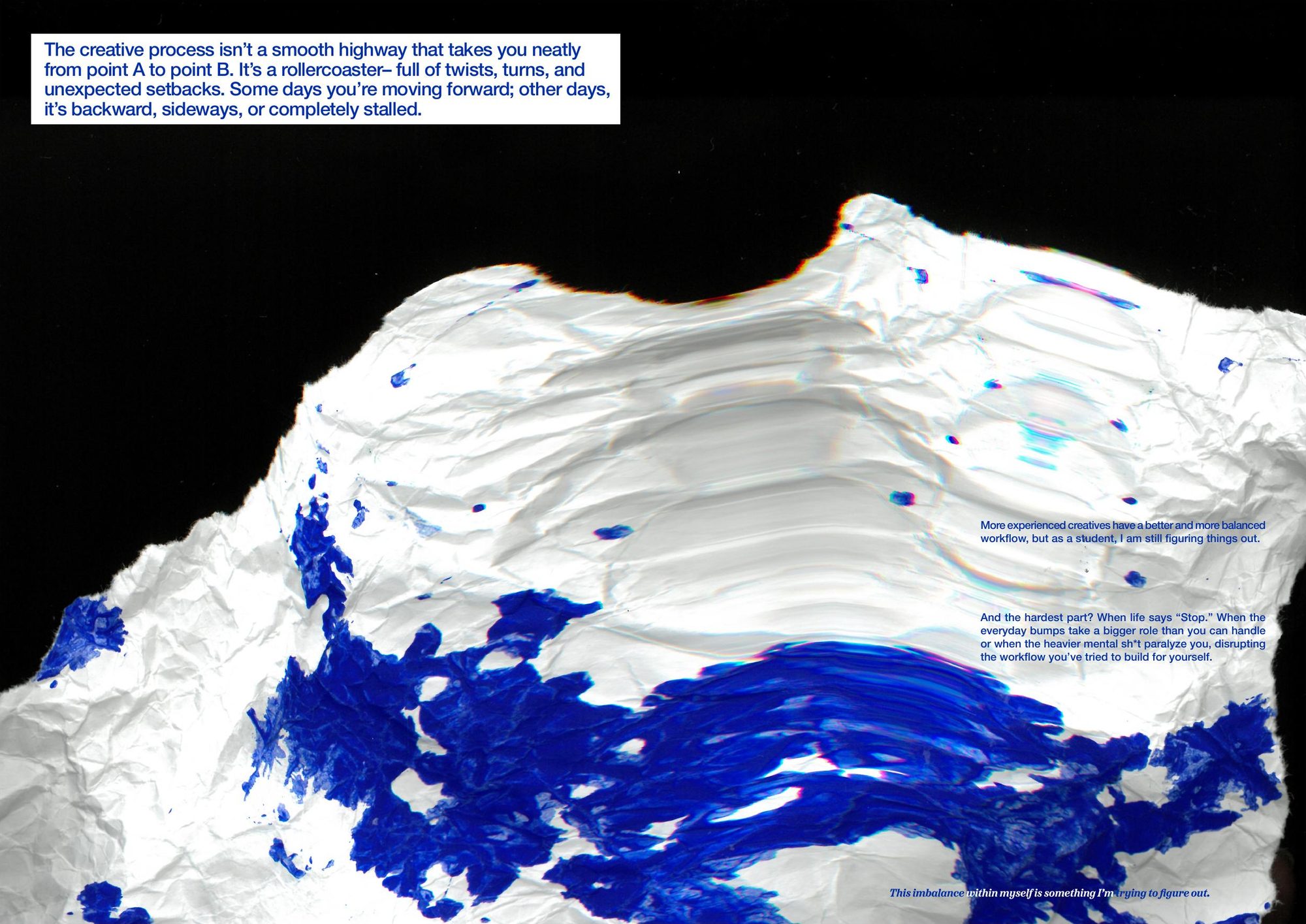
It opens with something honest: the creative process without the highlight reel.
The first article is a personal narrative I wrote myself, and it doubles as the editorial. Instead of a polished mission statement, it starts with the messy, non-linear reality of making things. The magazine introduces itself by being honest first.
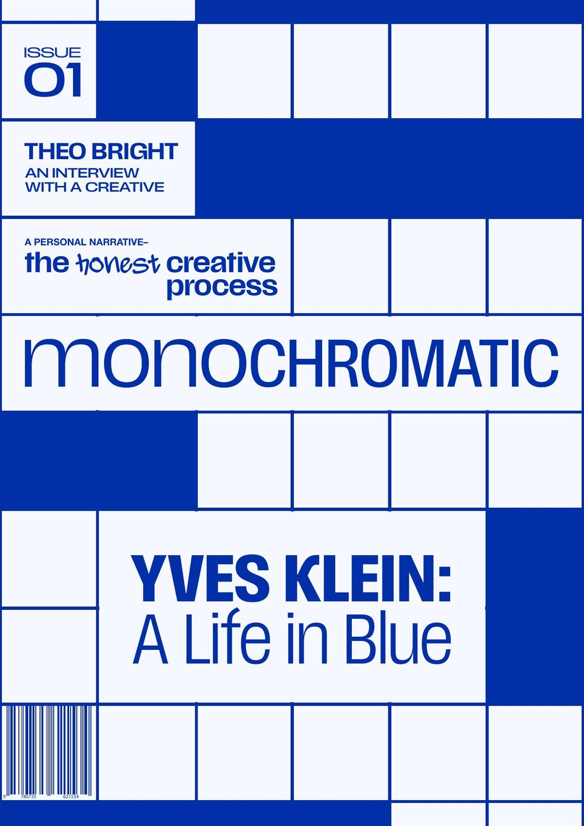
Yves Klein: a life in blue.
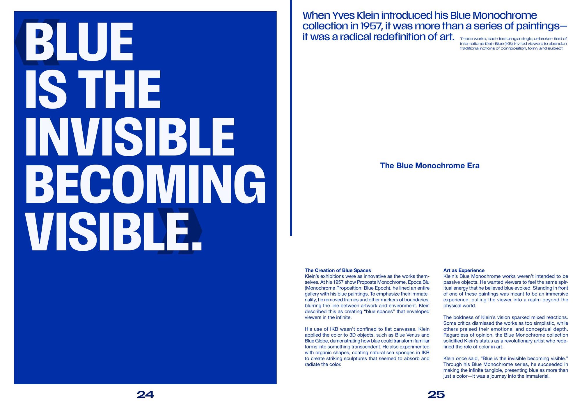
The anchor article traces the man who patented his own blue and said the whole world could be it. I researched him, used ChatGPT to help gather and draft the writing, then edited it back to the magazine's voice.
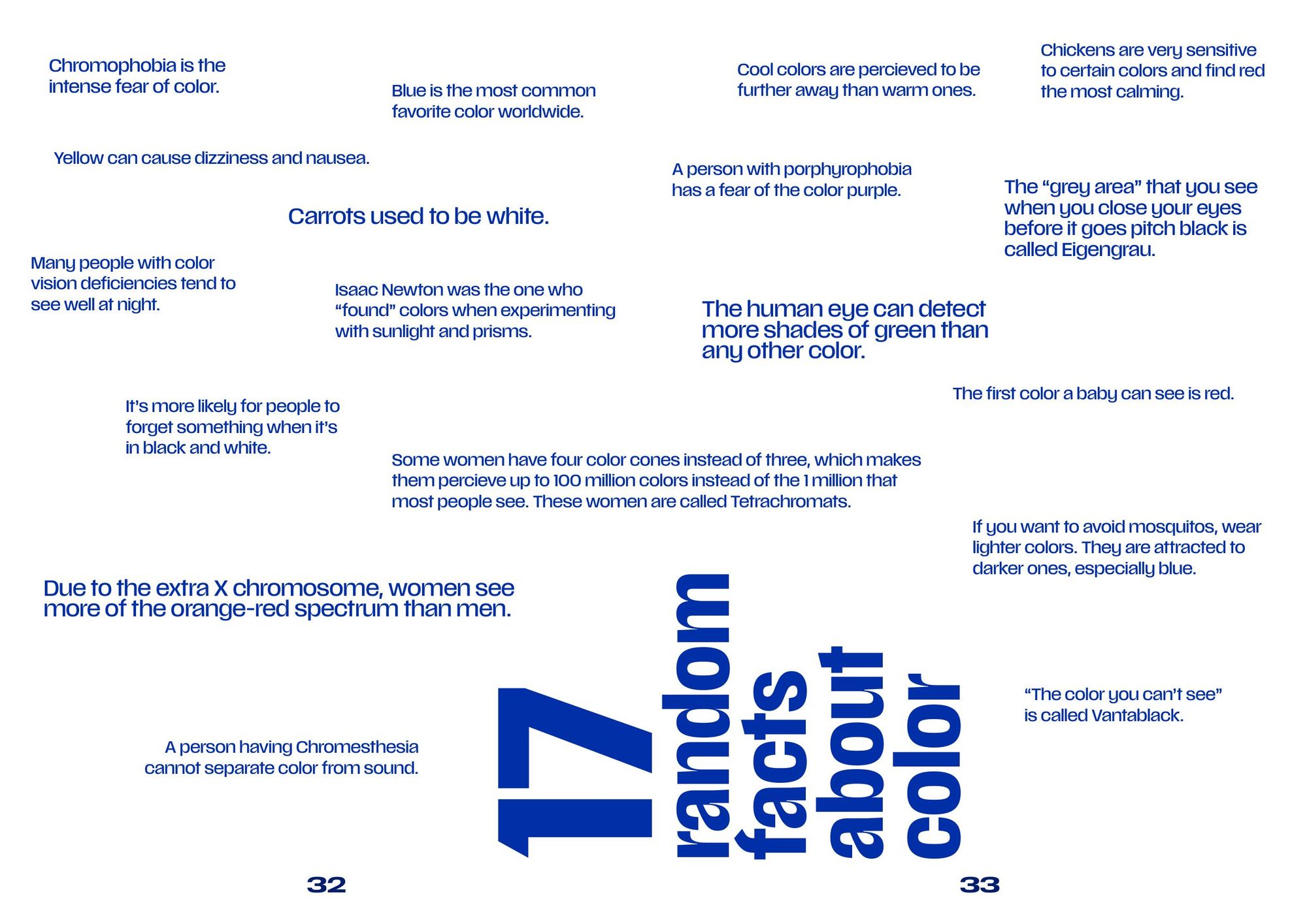
17 random facts about color, for the fun of it.
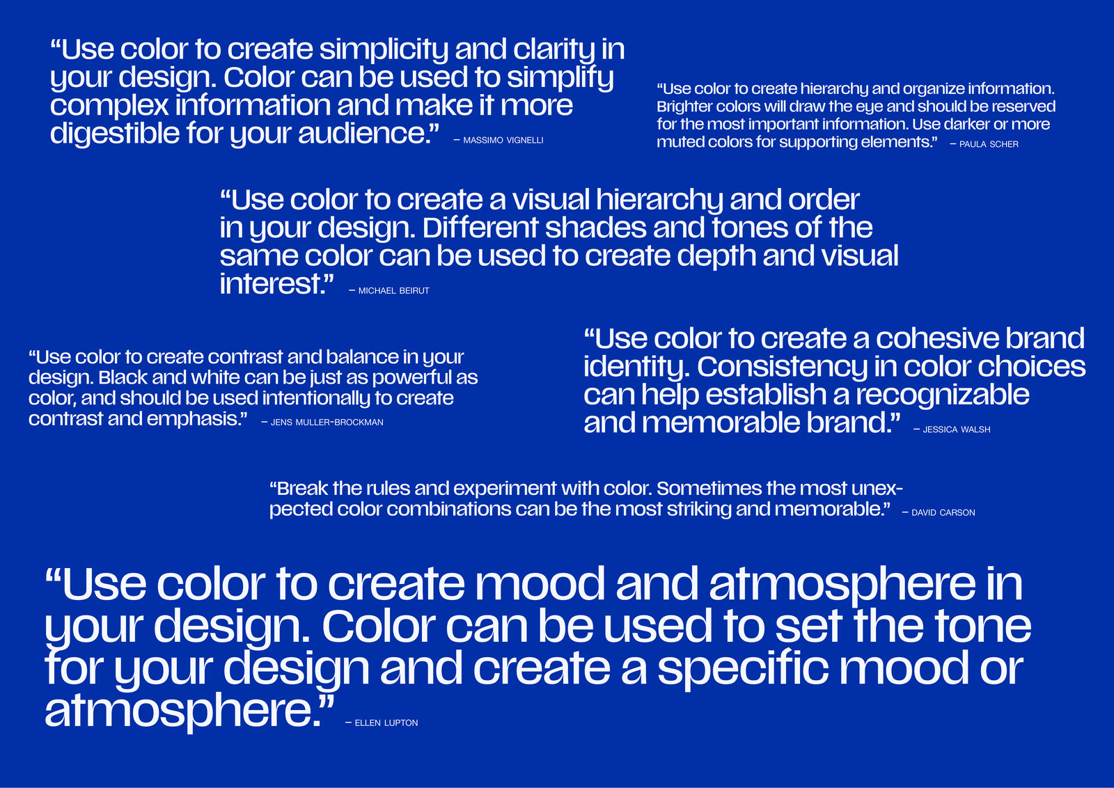
Between the features, some lighter pages: seventeen facts about color and a set of quotes from designers. The kind of thing you read in one sitting and repeat to someone later.
An interview with a creative.
A conversation with Theo Bright, a designer drawn to blue. It is a written piece rather than a recorded one, built to the magazine's voice and photographed with my brother as the face of it. It gives the issue a person talking about color, not just theory.

Mockups and a walk-through
of the whole issue.