Spawday  ·  Packaging 2024

spawday

Pet care by a dog, for dogs.

Role Packaging design and social templates
Deliverables Labels across the range, plus a set of social templates
Brand Spawday, a Swedish pet-care brand
The brief

Spawday already had a name, a face, and a story. It needed a packaging line that could sit on the shelf as the calm option and still feel like a dog made it.

The intention with the packaging was to give Spawday a clean, premium feel without losing the personality the brand is built on. It's my brother's brand, so I came in once the identity was set: the name, the lavender-and-blue palette, and Elvis drawn in a single line. My job was to turn that into labels for the whole range.

The approach

Clean labels, a soft palette, and a clear order to read them in.

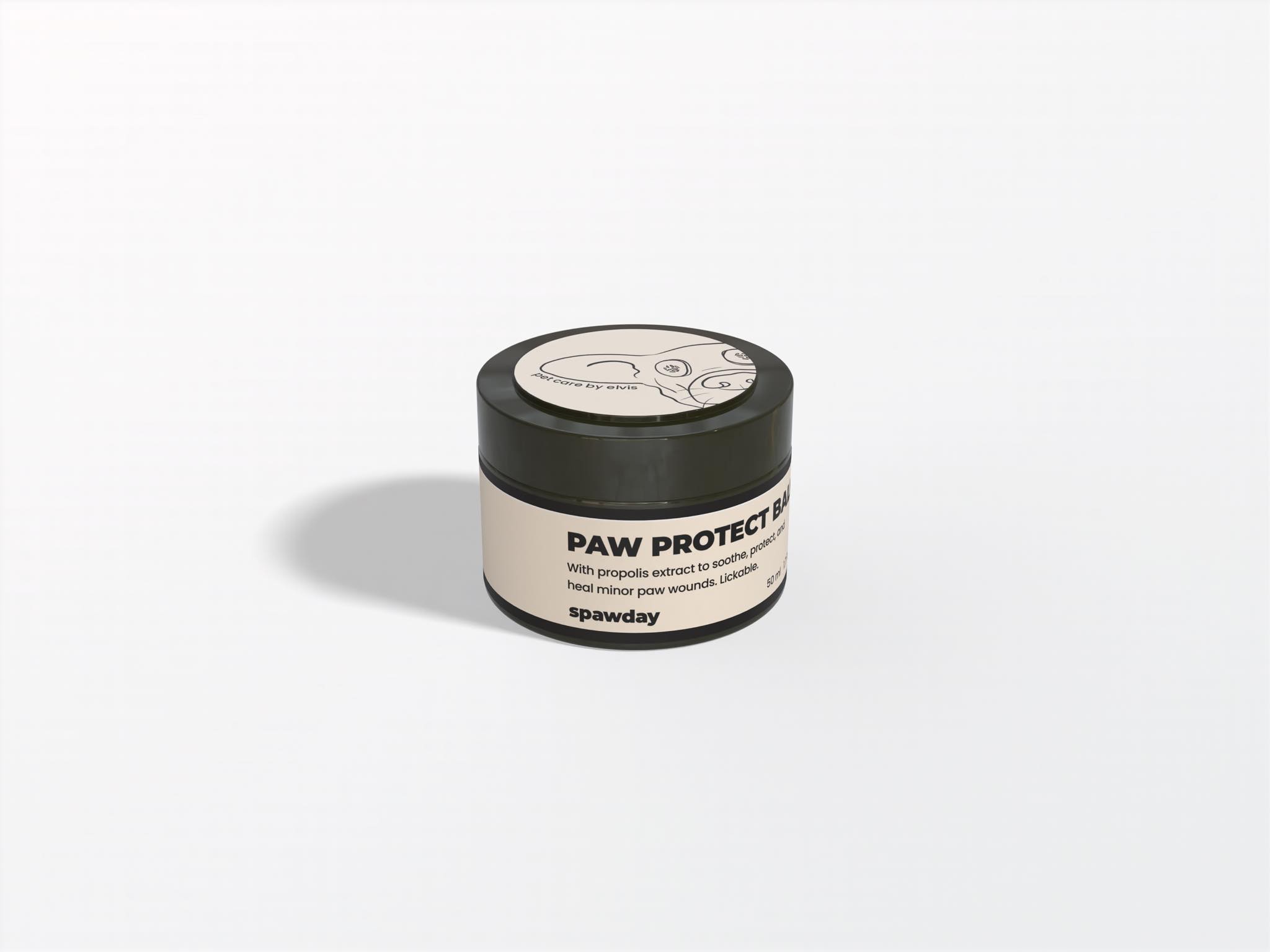
Each label leads with the product name, keeps the details in a calm block underneath, and gives Elvis a fixed spot at the bottom. The colour does the sorting: one tone per product, so the range reads as a family and you can still tell them apart at a glance.
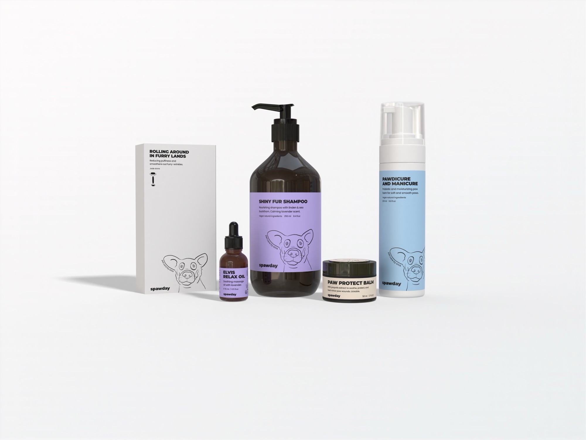
The full Spawday line: the shampoo, paw foam, relax oil, protect balm and jade-roller kit box, each label built on the same layout
The full range.
One system, five containers

The same label, across very different bottles.

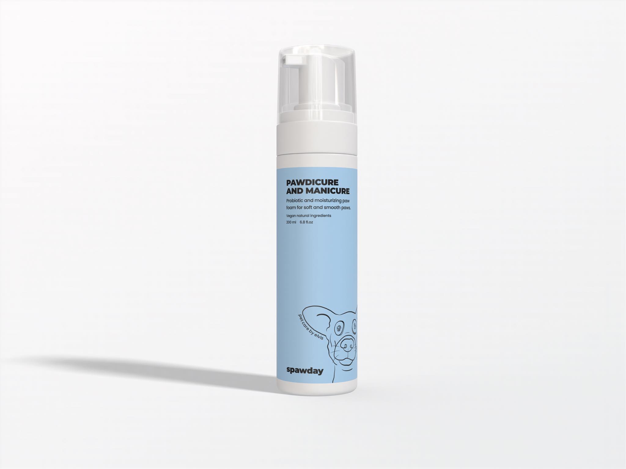
A tall foam pump, a little dropper, a squat balm jar, a big shampoo bottle. Each one is a different size and shape, so the layout had to flex without falling apart. Same structure every time, the name and the face in the same place, and the colour carrying the difference.

Shiny Fur Shampoo: an amber bottle with a lavender label, the product name set large above the details and the line-drawn dog face below
Shiny Fur Shampoo.
Pawdicure and Manicure: a tall white foam pump with a soft-blue label carrying the same layout as the shampoo
Pawdicure and Manicure.
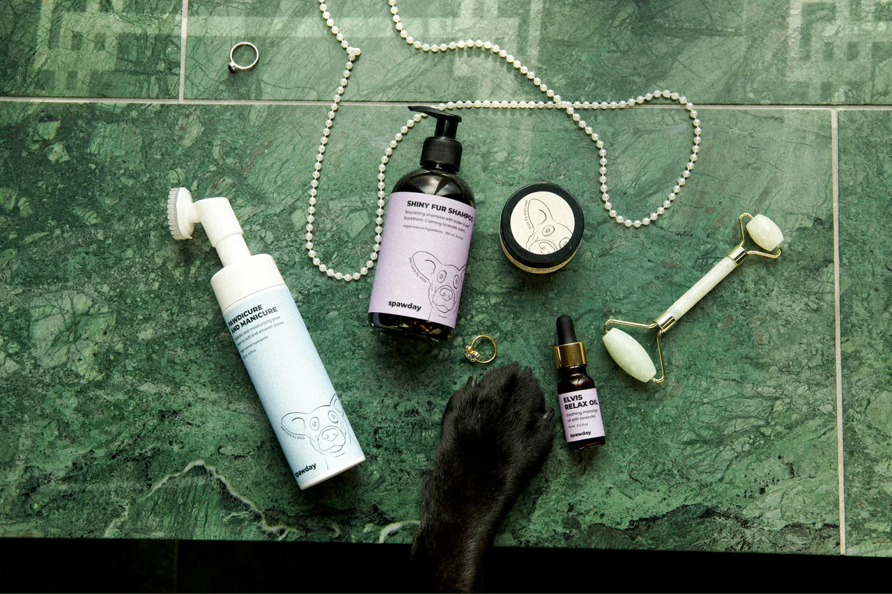
The Spawday range laid out on green marble with a string of pearls, a jade roller and a dog's paw resting in frame
In the bathroom

Photographed where it lives.

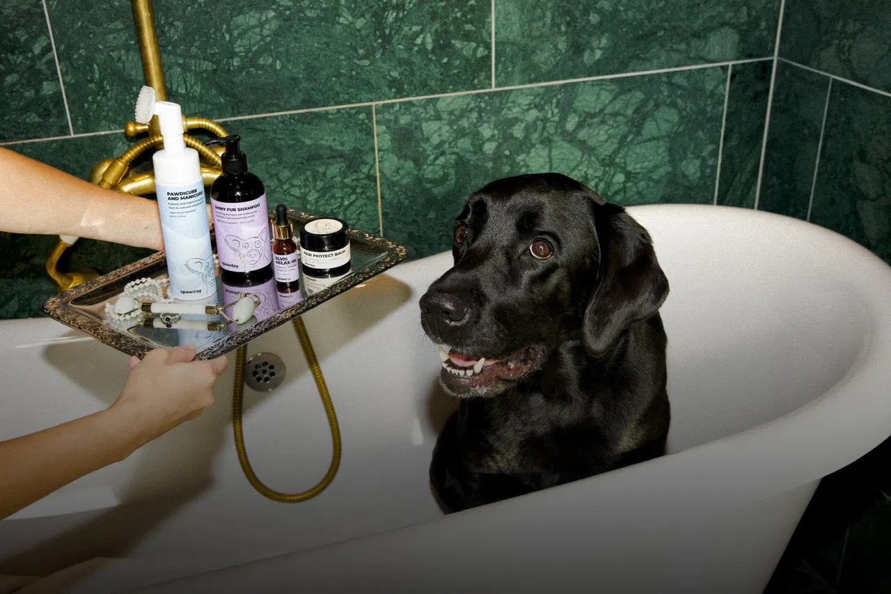
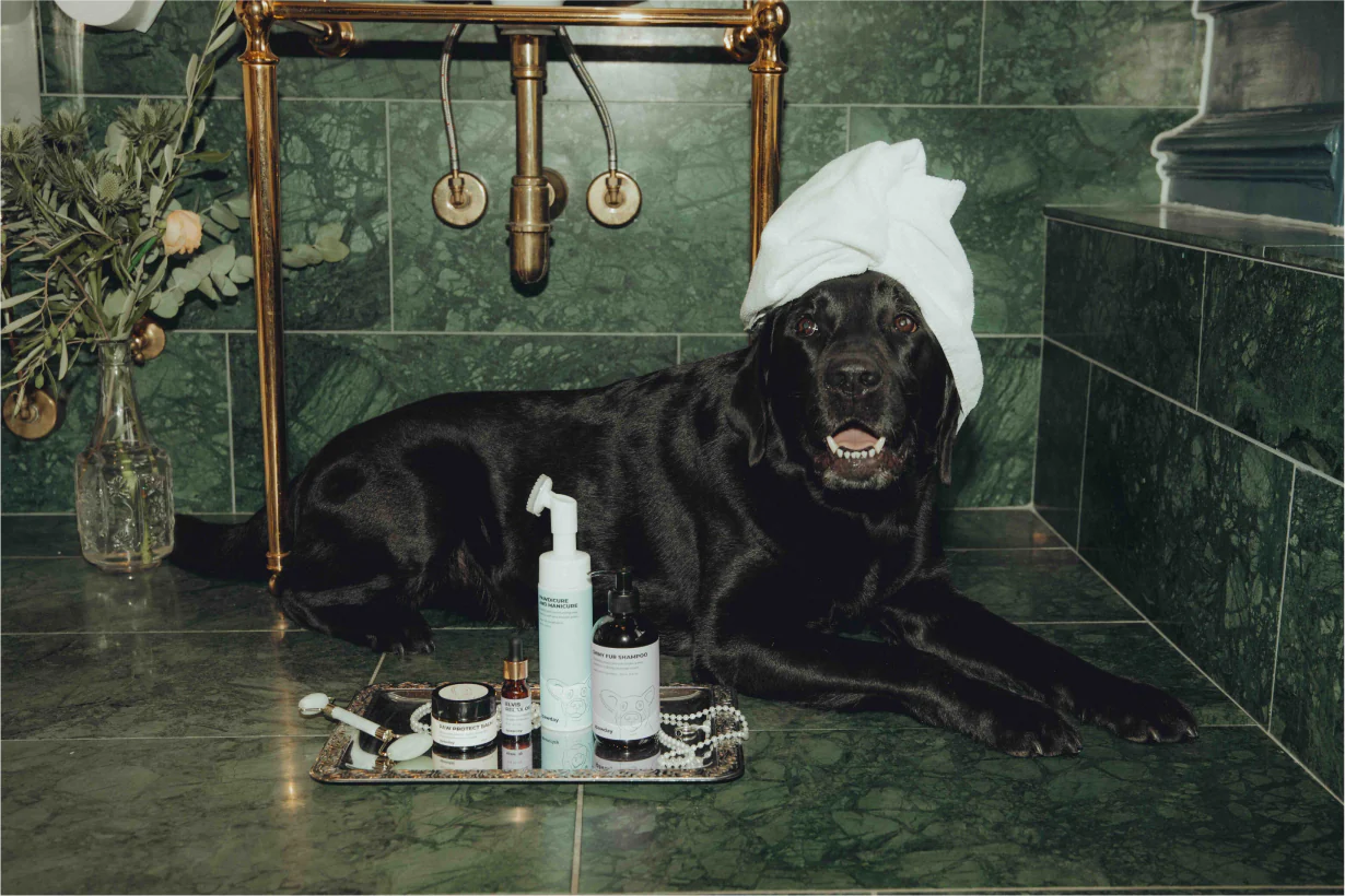
The line was shot by Jonathan Perlmann in a green-marble bathroom, with Elvis modelling. Seeing the products together with Elvis, was where the whole range came together.

A black labrador sitting in a white bathtub against green marble tile, a hand offering a tray of Spawday products at the edge
The same labrador on a green-marble floor with a white towel wrapped on his head, the Spawday products arranged on a tray beside him
For the feed

Templates so the brand could keep posting on its own.

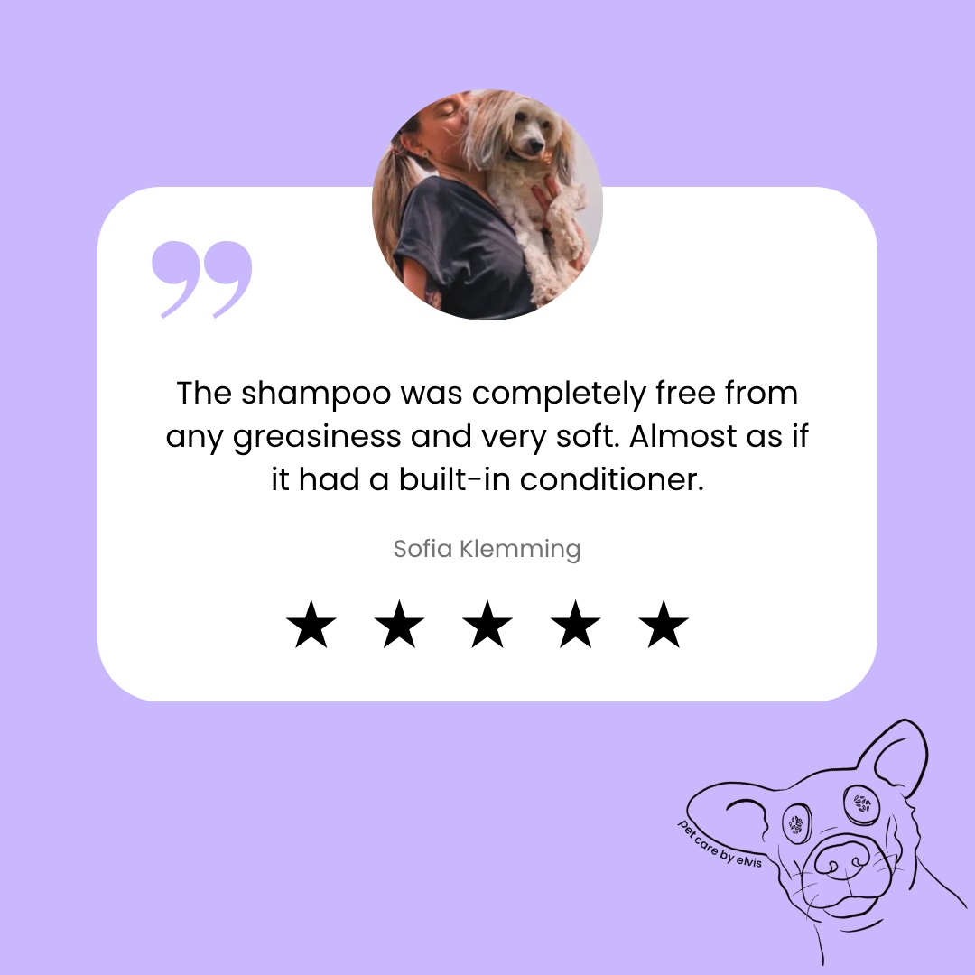
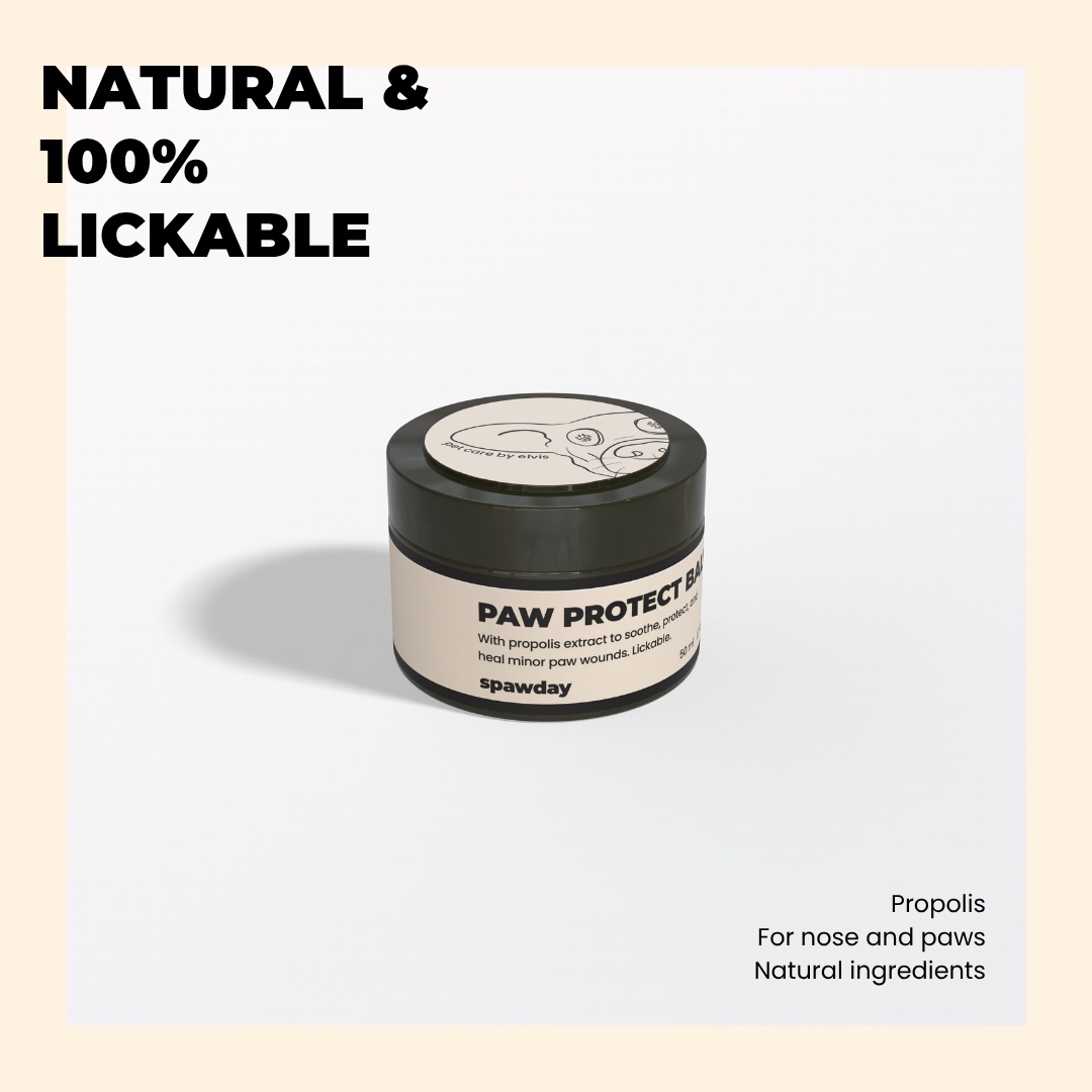
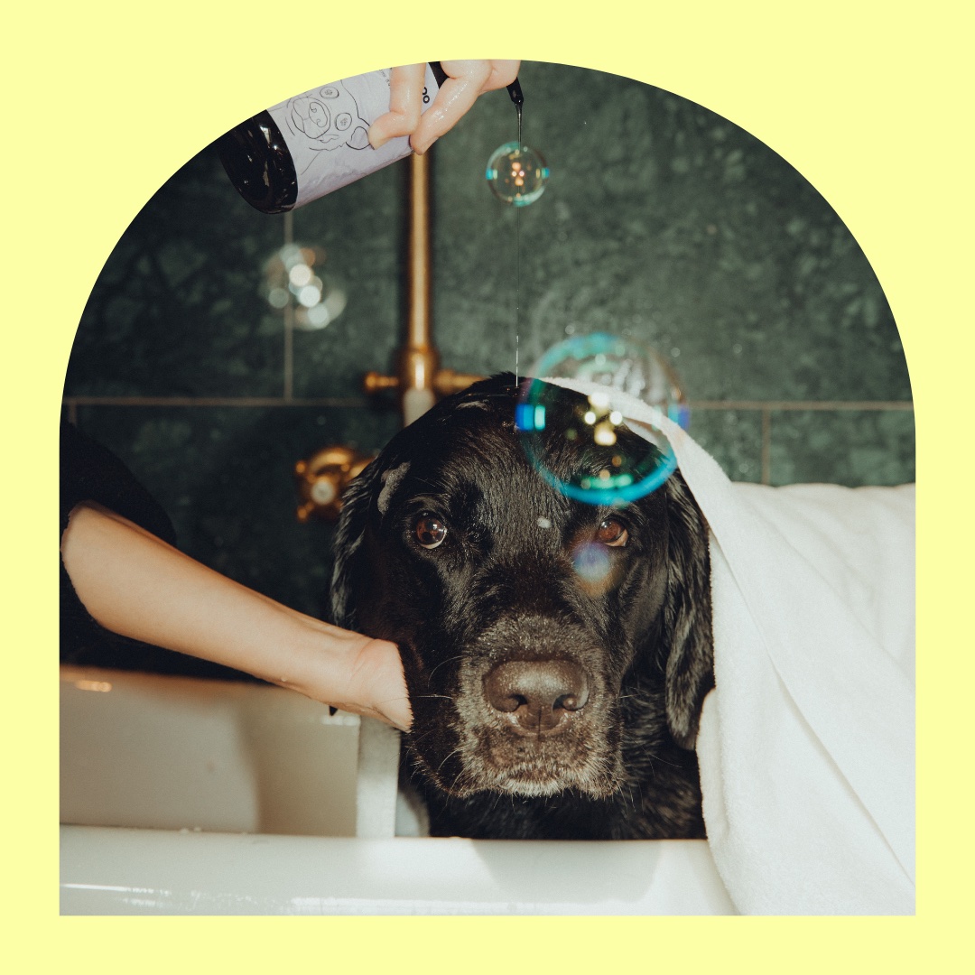
The social templates use the same building blocks as the packaging: the palette, the face, the type. A few set layouts for product posts, testimonials and text posts, so Spawday can fill a feed without rebuilding a design from scratch each time.
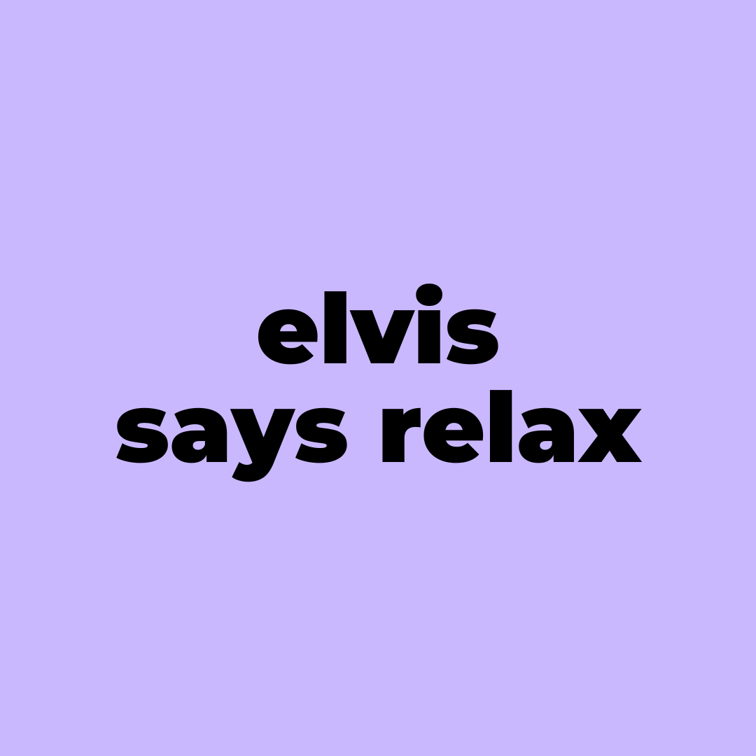
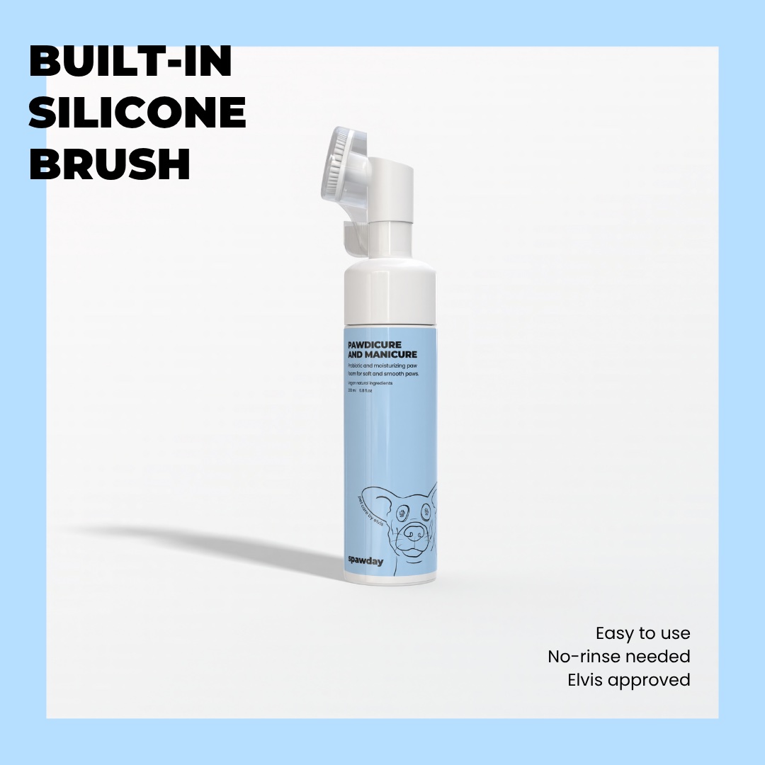
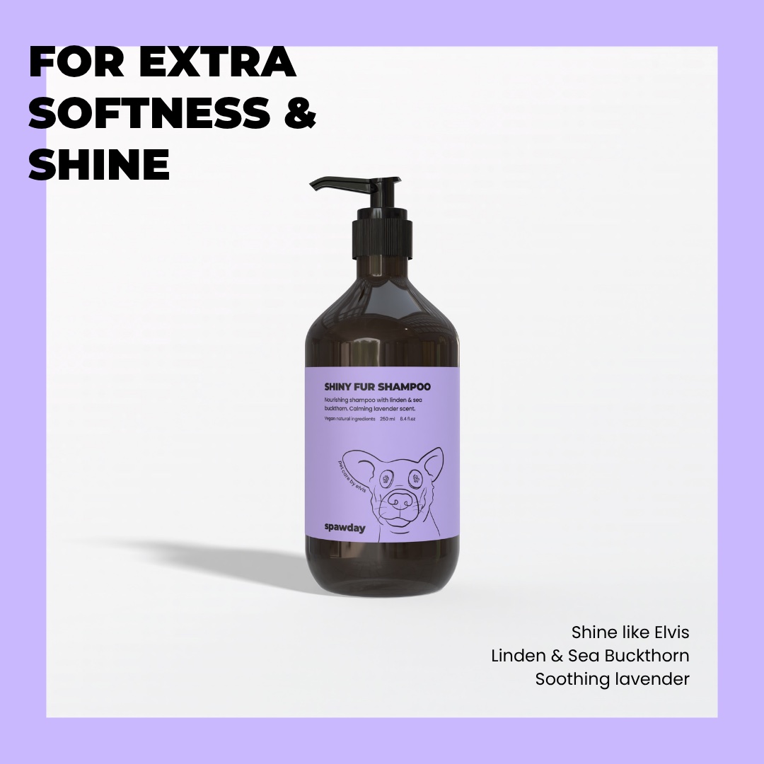
Text post: elvis says relax, set on lilac Product post for the paw foam on a blue frame: built-in silicone brush Testimonial post on lilac with a five-star review of the shampoo Product post for the paw protect balm on a peach frame: natural and 100% lickable Photo post: Elvis in the bath under an arched frame on yellow Text post: sunday is spawday, set on blue Text post: friday, saturday, spawday, set on yellow Product post for the shiny fur shampoo on a lilac frame: for extra softness and shine Text post: elvis ultimate spaw ritual, set on peach
Credits
Packaging and social templates
Emma Caroline Olesen
Brand and identity
Spawday
Illustration
Spawday
Photography
Jonathan Perlmann
Next
See all work